Using the reporting tools, you can build custom reports to evaluate your site’s geological, scheduling, and processing data.
You can create three types of reports:
Schedule Report: focused on operational scheduling metrics such as resource utilisation, haulage, and activity performance.
Activity Area Report: centred on geological data, reporting in situ and as-mined qualities like volume, density, and grade across pits, levels, and slices.
Closing Balance Report: summarises end-of-period inventories for dumps and stockpiles, supporting reconciliation and compliance.
All reports are built using a pivot table, where you define row and column fields and select data fields to populate the table. You can apply filters to narrow the scope and create calculated fields to derive new insights from existing data. A chart is automatically generated from the pivot table, offering a visual summary that’s easy to customise and interpret. Reports can also be exported.
Go to the Reporting tab to create and manage reports.
Initially, there are no reports. To create a new report, click New ![]() on the toolbar. You are prompted to select a report type.
on the toolbar. You are prompted to select a report type.
Once created, reports are listed in the report library. To open an existing report, select the report from the list.
The report type determines the fields available to you when you create the report. It makes the selection of fields more focused for the given context. The type of report you select determines which fields are available when building the report
A schedule report is a type of pivot table focused on operational scheduling data, such as metrics about resources performing different activities. It provides a structured summary of key metrics, helping you analyse mining, haulage, utilisation, and efficiency across various dimensions, such as time, resources, materials, or tasks.
Summarising the available fields, they include:
Time fields: Start and end times for reporting periods and tasks, with detailed breakdowns (e.g. hour, day, month, year).
Haulage metrics: Travel distances, times, truck counts, fuel/electricity use, and payload data.
Material flow: Tracks material movement, sources, destinations, pits, mining levels, and resources.
As-mined (ROM) properties: Includes principal fields like volume, mass, and density—and fields specific to material types like gold grade—representing the material after it’s mined.
Productivity: Measures like operating time, production rates (actual nominal, entered), resource efficiency, and utilisation.
This report type is ideal for operational analysis to monitor progress, identify inefficiencies, and make informed decisions based on actual versus planned performance.

[Pit = East Pit] And [Period Name = P1 P2 P3] And [Activity Area Is not blank]
Resource productivity and efficiency comparison across activities for periods P1 and P2
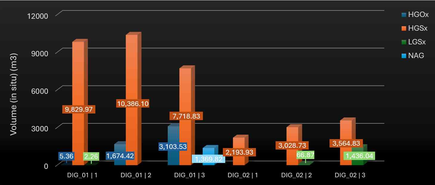
An activity area report focuses on the geology of activity areas. It reports on both in situ (natural state) and as-mined (run-of-mine or ROM) qualities and quantities—such as volume, density, and grade—for each material type. These attributes can be evaluated across various dimensions, including pit, mining level, and slice.
Summarising the available fields, they include:
Material flow: Includes activity area, pit, mining level, slice, material movement, and resource assignment.
As-mined properties: Post-mining measurements such as volume, mass, density, thickness, and gold grade.
In situ properties: Pre-mining geological estimates using the same structure as as-mined fields.

[Material Is not blank] And [Mining Level Is not blank] And [Mining Level ≠ 1050] And [Activity In Drilling Mining]
Material volumes by pit, mining level, and activity.
Showing the distribution of material types for drilling and mining activities at each level in the east pit
A closing balance report is a type of pivot table focused on reporting the closing inventories of dumps and stockpiles. It helps track the final state of material quantities and qualities at the end of a reporting period, supporting reconciliation, planning, and compliance.
Summarising the available fields, they include:
Time fields: Start and end of the period, with detailed breakdowns (e.g. day, hour, month, year).
Location fields: Evaluates staged stockpiles (filled or depleted status, individual piles, individual parcels), dump blocks, dump lifts, and general location identifiers.
As-mined properties: Captures physical and geological attributes such as volume, mass, density, thickness, and grade (e.g. AuOz).

[Location ≠ Leach Pad] And [Period Name in P1 P2 P3]
Closing mass balance by and location type – showing dump and
stockpile inventories across the first three periods (excluding the leach pad)
On the toolbar, you can:
![]() Remove a report.
Remove a report.
![]() Save the current report.
Save the current report.
![]() Save the current report as a new report.
Save the current report as a new report.
![]() Rename the current report.
Rename the current report.
![]() Toggle the refresh mode.
Toggle the refresh mode.
When it’s automatic, the report data is updated whenever the updated schedule data is sent to Client. When it’s manual, the report data is updated whenever you click Refresh. If the schedule data and report data is in sync, the button is greyed out.
A report presents data using both a pivot table and a chart:
The pivot table is used to build and display the report by selecting fields and organising how their values are presented.
The chart visualises the pivot table data. You can configure how the information is illustrated.
The software automatically generates the chart based on the pivot table. You can customise the chart’s layout to suit your reporting needs.
A pivot table is a reporting tool that summarises data from the latest schedule. It’s fully customisable and designed to help you extract meaningful insights from operational data.
Pivot tables draw from a wide range of fields—including principal attributes, location data, time-based fields, and calculated measures—and present them in a structured, cross-tabular format. The fields available depend on the report type, which may focus on activity areas, closing inventories, or general scheduling outcomes.
You can apply filters to narrow the data by time period, location, equipment, material type, or other relevant criteria.
In a pivot table, you define:
Row fields, which determine the categories listed down the side of the table (e.g. materials, equipment types, benches).
Column fields, which define the categories across the top (e.g. destinations like dumps or stockpiles, or time periods).
Data fields, which populate the intersecting cells with values (e.g. mass, volume, operating hours, cost).
Each cell in the table represents a specific combination of row and column values. For example, if the row field is Activity Area, the column field is Period, and the data field is Mass, then each cell shows the mass mined in a specific activity area during a specific period.
You can also define multiple nested row or column fields to create more detailed groupings. For instance:
Rows could be nested as Pit > Activity Area > Material.
Columns could be nested as Period > Location Type.
This allows you to drill down into the data and compare values across multiple dimensions at once.
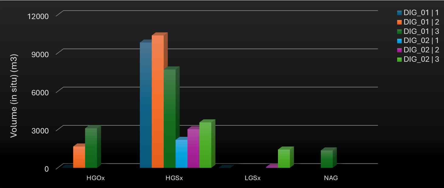
The Data field refers to the actual metrics or measures being analysed. It appears when there are at least two entries in the Data Area. In this example, it refers to the Volume and Density fields and occurs in the column headers.

In this pivot table, the data fields appear as column headers – and their values are populated across rows. This setup causes each activity area to split into two sub-columns: one for Volume and one for Density. The values are then populated for each period.
Data can be dragged into the row or column areas.
If you drag Data to the row area, each data field (e.g., Volume, Density) appears as a row label – and the label values are displayed across columns (e.g, by Activity Area).
If you drag Data to the column area, the data field will instead appear as column headers, and the values will be displayed across rows (e.g., by Periods).

In this pivot table, the data fields appear as rows – and their values are populated across columns.
This setup causes each period to split into two sub-columns: one for Volume and one for Density.
The software automatically generates a chart from the pivot table. You can fully customise it, changing its type, orientation, and more.

[Pit = East Pit] And [Slice In 1 2 3] And [Material Is not blank]

An example of how the software generates a 3D side-by-side bar chart from a pivot table
A chart is made up of several elements.
|
Chart element |
Description |
|---|---|
|
X-Axis Y-Axis |
These are the horizontal and vertical axes that display field values from the pivot table’s Row Area or Column Area, depending on the chart configuration. They serve as reference grids for plotting data points, providing the coordinates for each value.
Field values are plotted along the axis in intervals. When there are many values (e.g., a wide numeric range), a subset of representative labels is shown. If the pivot table includes hierarchical fields, their values appear as nested labels (e.g., Activity Area > Slice). |
|
Series |
A series is a set of related data points that share the same category or variable. These data points are plotted using:
Each series typically represents a distinct category (e.g., a material like HGSx or LGOx) and shows how that category's values vary across the X-axis. For example, each material could be a separate series, showing its volume within different activity areas. |
|
Plot area |
The plot area is the central part of the chart where the data is visualised. You can control how the data is represented and visualised. |
|
Legend |
Maps each series to its corresponding colour and label. |
On the sidebar, click Options to reveal the chart display and pivot table properties.
|
Chart Appearance |
|
|
Chart Type |
Defines how data is visually represented in the plot area, such as bars, lines, areas, or pie slices. It determines the style of the chart and how each data series is displayed. |
|
Show Point Labels |
This option displays a label directly on each data point (e.g., bar, line, or area) within the plot area, showing its exact value. |
|
Only Show Selected Data in Chart |
Displays chart data only for the cells currently selected in the pivot table. To select multiple cells, click and drag, or hold Ctrl and click individual cells to include them in the selection. |
|
Continuing from the
example above. This chart has a Chart Type of Bar Side By Side
Series 2D. |
|
|
Chart Orientation |
|
|
Generate Series From Columns |
Defines whether the series values derive from the Column Area fields. When this property is selected:
|
|
Generate Series From Rows |
Defines whether the series values derive from the Row Area fields. When this property is selected:
|
|
Continuing from the example
above (which uses
Generate Series From Columns), |
|
|
Pivot Table Options |
|
|
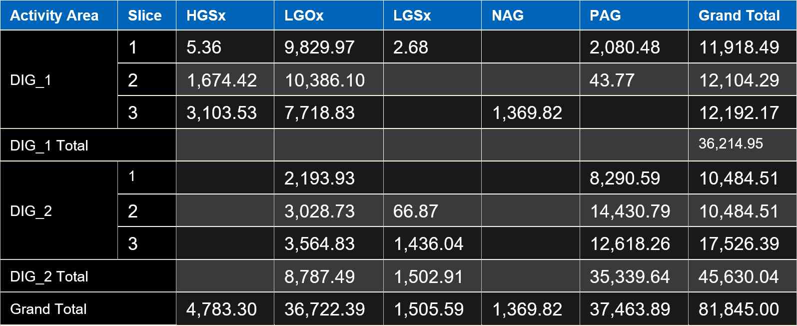
Show Column Grand Total |
Adds a Grand Total column to the right of the table, summing up all values across each row. |
|
Show Row Grand Total |
Adds a Grand Total row at the bottom of the table, summing up all values in each column. |
|
Show Row Totals |
Displays subtotals for grouped rows (like DIG_1 Total, DIG_2 Total…). |
|
An example of displaying the total columns and rows |
|
|
Report Availability |
|
|
Make Report Available To All Users |
Makes the report visible to other users of this site. |
A calculated field is a custom field you create within a report layout using an expression or formula. It’s not part of the original dataset and doesn’t appear in published data feeds – it exists only in the report view.
On the Options menu click Add Calculated Field to create a field.
A dialog is shown, where you must define the field’s name and result type.
|
Add Calculated Field |
|
|
Name |
Assigns a name to the field. It must be unique. |
|
Result Type |
Specifies the data type of the result the expression will return. Options include:
|
|
Decimals |
For numeric fields, this setting defines the number of decimal places to display in the result. |
Click Save to proceed.
In the expression editor, build a formula that determines the value that the calculated field will return. The expression must align with the result type you selected. The expression can reference system-provided fields, constants, operators, and functions.
|
Name |
Type |
Expression |
Description |
|---|---|---|---|
|
High Density Flag |
Boolean |
Iif([Density] > 2.5, TRUE, FALSE) |
Flags whether the density exceeds 2.5. |
|
Adjusted Volume |
Numeric |
Iif(IsNull([Volume (In Situ)]), [Volume] * 1.1, [Volume (In Situ)] * 1.1) |
Applies a 10% swell factor to volume, using in situ value if available. |
|
Gold Content (oz) |
Numeric |
[Au] * [Mass] |
Calculates total gold content based on Au grade and mass. |
|
Gold Grade Band |
Text |
Iif([Au] >= 1, 'High Grade', 'Low Grade') |
Categorises gold grade into high or low |
Click OK to confirm the expression.
For a full list of all report fields and functions, see Field References.
Once created, the field appears under the Calculated Fields group. You can:
Add to report: Drag the field into the filter, column, row, or data area.
Remove a field: Right-click the field in the report and select Remove.
Edit an expression: Right-click the field and choose Edit Expression.
When you create a new report, it starts empty. You build the report by adding, removing, and organising fields using the Field List.
The Field List is a control panel. It shows:
All available fields you can use in the report.
The four layout sections where you can place those fields.
Fields are grouped by categories such as date, haulage, material flow, productivity, and so on.
Within the control panel, there’s a list of fields that you can add to the report. The available fields depend on the type of report you're building.
Reports are made up of:
Attributes: Fields with non-numeric, descriptive values, such as Resource, Activity Area, and Period Name.
Measures: Numeric fields that can be aggregated or calculated, such as Volume, Payload, Fuel Consumed, and Operating Time.
The available fields are listed and grouped by category (such as Date, Haulage, Material Flow…). Expand a category to reveal its fields or use the search function to find specific fields.
For descriptions of all available fields, refer to Field References.
In situ and scheduled (as mined) data can be separately reported on and published. This is particularly useful for the reconciliation of inseparable scheduled materials against the in situ block model data.
In situ principal fields are available in:
Publish Activity Areas Data Feed Out
Request Design Data Feed Out
Activity Area Reports
Scheduled (As Mned) principal fields are available in:
Publish Activity Areas Data Feed Out
Schedule Results Data Feed Out
Request Design Data Feed Out
Publish Closing Balances Data Feed Out
Activity Area Reports
Schedule Reports
Closing Balance Reports
There are four area sections that determine how the report is structured. When multiple fields are placed in a row or column section, they are nested in the order listed.
Attributes (non-numeric fields like resources or activities) are typically used to organise rows and columns. Measures (numeric fields) are typically used to return values at the intersection of row and column combinations.
|
Section |
Purpose |
Example |
|---|---|---|
|
Filter Area |
Filters the entire report based on selected values. |
If you add the Pit field, and if you select only East Pit, the report will only show data for the east pit. |
|
Column Area |
Fields placed here become column headers in the report. |
Add Activity Area to divide the table into columns (e.g., DIG_01, DIG_02, DIG_03). Add Period Name above it to nest columns by period (e.g., P1 > DIG_01, DIG_02). |
|
Row Area |
Fields placed here become row labels. |
Add Data to create a row for each metric (e.g., Volume, Density). Add Resource above it to nest rows by equipment (e.g., Shovel1 > Volume, Density) |
|
Data Area |
Fields placed here are metrics or measures to be calculated. |
Add Volume, Density, Payload, or Fuel Consumed to analyse values at the intersection of row and column fields. |
You can add, remove, and relocate fields by clicking and dragging.
Add a field: Click and drag a field from the Field List into one of the layout sections.
Remove a field: Click and drag a field from a section back into the Field List.
Relocate a field: Click and drag a field from one section to another to change its placement.
By default, when you rearrange fields in a pivot report, the layout updates immediately, showing the result of each change in real time. However, if you're making multiple changes, this can slow down performance or make it harder to manage the layout.
To control when the report updates, select Defer Layout Update.
The report will not update automatically as you move fields. Once you’re done rearranging, click Update to apply all changes at once.
Within the control panel, you can control how the field and area sections are laid out.
Options include:
The field section is stacked at the top, with area sections displayed below in a 2×2 grid.
The field section is docked to the left, with area sections displayed to the right in a 2×2 grid.
Only the field section is shown.
Only the area sections are shown in a 2×2 grid layout.
Only the area sections are shown, stacked vertically one above the other.
By default, a report evaluates values across all added attributes and measures. For example, when calculating the number of tonnes mined by Shovel1 in Period1, the report includes all locations where that resource operated during that period.
However, you can limit the scope of analysis by applying filters. Filters help you focus on specific data segments and improve the relevance of your analysis.
Filters are useful for:
Focusing on a specific range of data.
Excluding outliers, blank data, or irrelevant data.
Comparing only meaning subsets of data.
Following the example above, if you apply a Pit filter and select only East Pit, the report will evaluate:
The number of tonnes mined by each resource
In each period
Only within East Pit
You can apply filters at two levels:
|
Filter Type |
Purpose |
Example |
|---|---|---|
|
Overall Filter |
Applies a filter to the entire report. It limits the scope of all fields – based on the selected values of a specific field. |
The Pit field is added to the Filter section. Within that field, only East Pit is selected. Therefore, the software evaluates only data from the east pit. |
|
Field Filter |
Applies a filter to a specific field in the report layout (e.g., a row or column field). This limits the values that are included in the report for that field. |
Volume is added to Row Area. You apply a Volume filter with a range of 1000 to 3000. The report only returns results where the volume value falls within that range. |
You can filter the range of values to look for within a field. The report will ignore values outside of this range.
If the field is an attribute (i.e., contains non-numeric values like pit or resource names), you can set up attribute field filters using rules or by manually selecting values.
On an attribute field, click Filter ![]() to open the filtering options.
to open the filtering options.
Go to the Filter Values tab to manually select which values to include or exclude in the report.
A list of possible values is shown.
Select the fields you want the report to evaluate.
Clear the fields that you want the report to ignore.
Using the filter block expression editor, you can create rules that determine the returned values according to certain conditions.
For more information, see Build Filter Expressions.
If the field is a measure (i.e., contains numeric values like volume or grade), you apply a numeric filter by selecting a range of values.
The histogram shows how values are spread across the range. Each bar represents a subrange of values. The height of the bar indicates how frequently values in that subrange occur, indicating where most of the data lies.
Use the Show values from X to Y option to set a numeric range. You can also drag the vertical splitter bars on the histogram to adjust the range interactively. Values outside of the range are greyed out.
Pivot tables often organise data into hierarchical levels of rows and columns. When you apply a filter to a numeric field (like Volume), the software needs to decide at which levels to evaluate that field.
For the row and column fields in the report, you can select the field level to evaluate at.
Lowest level (default): The filter is applied to the most detailed level of data.
Higher level: The filter is applied to a broader aggregation of data.
This choice affects the range of values shown in the histogram, the granularity of the filtering, and the context in which the numeric values are interpreted.
To select a custom level, select Apply to specific level, then specify a new row or column field.
Let’s say the row hierarchy is Pit > Mining Level > Activity.
Using the default (Activity), you filter individual activity volumes.
If you set the evaluated level to Mining Level, you filter the total volume per mining level (i.e., sum of all activities), resulting in a broader value range.
You can control how pivot table rows are sorted—either in ascending or descending order—based on the values of a row field.
Pivot tables often have nested row fields (e.g., Pit > Mining Level > Activity). Sorting can be applied at different levels, affecting how values are ordered within their parent field.
To apply a sorting order, click Ascending or Descending next to the row header label.
In some cases, the pivot report may display blank cells. These typically occur due to missing values in either grouping fields or data fields.
![]()
HGSx, LGSx, and PAG volumes exist within West Pit but aren’t assigned to a mining level, resulting in a blank mining level category. Some mining levels in both pits also lack certain materials, leading to blank cells for those combinations.
Each row in a pivot table is grouped by one or more attributes (e.g., Mining Level, Pit). If a row of data is missing a value in one of these grouping fields, the report will still include it – but it will appear under a blank category.
For example, if some material records are not yet assigned to a Mining Level, they will appear under a blank mining level group. This indicates that the data exists, but is not yet associated with a specific mining level.

[Mining Level Is not blank]
Applying a filter to remove any rows with blank Mining Level values
In other cases, a data cell may be blank at the intersection of a row and column. This means that for the given combination of fields, no data exists.
For example, if no recorded Volume for Pit1 is found at Mining Level 1100, the cell at that intersection will be blank.
You can apply filters to hide blank rows or columns from a report. To do this, on a given row or column that is entirely blank, when applying a value to filter, select (Blank).
Reports can be exported to various formats. On the sidebar, click Export to open the export options.
From the Export list, you can export the pivot table or chart to a certain format.
Pivot table export options include:
Excel
Excel Grouped
CSV
HTML
Chart export options include:
Excel
HTML
Image
From the export options, you can print the pivot table, chart, or both.